
Challenge
Immigration law is a high-anxiety category. Clients arrive uncertain, compare firms under pressure, and get shown the same playbook everywhere they look: flags, gavels, courthouse imagery, dense credential lists, and almost no explanation of what actually happens after they hire someone. Bright Future needed an identity and a website authoritative enough to stand against established firms, yet clear and human enough to meet clients where the anxiety actually lives. It also had to work as a firm-first platform, representing the practice as a whole rather than one attorney's personal brand.
Solution
We started with research, not design. Using the Revenue-Engineered Branding process, we ran a structured competitor and market scan across the category, from boutique practices to global players, alongside legal-technology references that show what a modern, client-first legal brand can look like. One pattern held almost everywhere: firms foreground credentials, and almost none explain the client journey. Visual identities split cleanly between traditional and corporate-abstract, leaving open space for a brand that is modern, precise, and calm without falling into either cliché. Those findings became design guardrails, evidence-based rules for color, typography, logo construction, and tone. Nothing in the final identity was chosen on aesthetic preference alone.
Impact
- Built a complete logo system with primary, secondary, and alternative lockups, legible from favicon to signage, deliberately avoiding the scales, gavels, and flag imagery the research flagged as non-differentiating
- Engineered a full color and typography system for trust and accessibility, anchored by the firm's signature navy
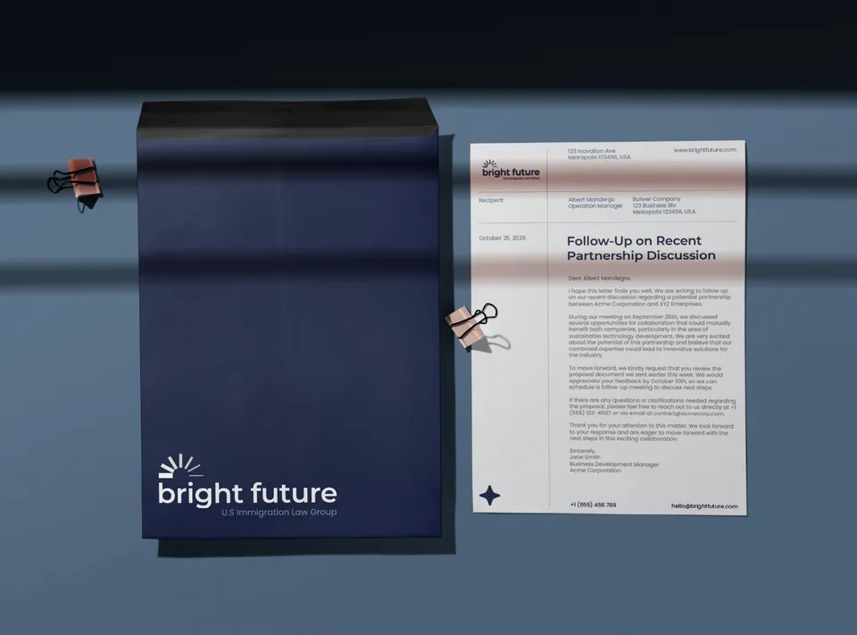
- Delivered a complete application set: stationery, email signature, social templates, iconography, and a brand guidelines document that lets the identity scale to every future touchpoint
- Restructured the site from an attorney-led model to a firm-led one, organized entirely around the client's own situation
- Produced the site's defining architecture: two parallel service categories, one for individuals, families, entrepreneurs, and investors, and one for companies and employers, each with detailed service pages built from real client needs
- Wrote legal-advertising compliance directly into the copy from the start rather than editing it in afterward
- Built an enablement layer of walkthrough videos and a written guide library so the team can run the site without outside help
The outcome
The brand and website are complete, live, and published. The most telling result was structural: the firm-led architecture was not something the client arrived with. It emerged from the work and was adopted because it was clearly the stronger model. That is the clearest signal the process is doing its job, when research does not just inform the final product but changes how the client understands what the product should be. Bright Future now owns an identity system and a site architecture that reflect how the firm actually wants to be read: not as one attorney's practice, but as a modern, credible firm built around the people it serves.